Cooler Master Cosmos II: Large and in Charge
by Dustin Sklavos on January 23, 2012 3:20 PM EST- Posted in
- Cases/Cooling/PSUs
- Cooler Master
- Full-Tower
In and Around the Cooler Master Cosmos II
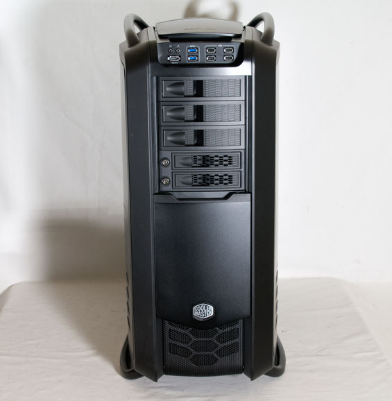
Cooler Master's Cosmos II is a big, fairly attractive hunk of steel, aluminum, and plastic. The black finish with blue LED indicators isn't going to light the world on fire with its stunning originality, but the overall styling is actually just under being too gaudy. Gaming and enthusiast cases always run the risk of looking outlandish or ridiculous, but the Cosmos II is mostly able to avoid the same fate. Honestly, what you're really going to notice is the sheer size of the thing.
Unlike most cases, there's something happening on every side of the Cosmos II. The top has two heavy aluminum bars affixed to the case's steel frame, and those bars are designed pretty much exclusively to help you actually move the enclosure. Between them, to the rear is a giant vent made of tough plastic and metal that's designed to support up to a 360mm watercooling radiator. Towards the front is a control panel with four independent fan control channels, an LED toggle, and the power and reset buttons, masked with a sliding plastic hood.
This hood is where I first ran into trouble. Simply put, it's chintzy, and on my review unit it actually broke off. That hood is held in place with two plastic rails, but one of those was damaged when I received the case, and with a minimal amount of force (if I'm complaining about lifting a 50 pound case, trust me when I say "minimal") the whole thing snapped right off.

When we get to the front of the Cosmos II, under that hood there's a healthy amount of connectivity: four USB 2.0 ports, two USB 3.0 ports, an eSATA port, and the two audio jacks. The external drive bays are actually shielded by a cover that is held to the top of the case magnetically but slides down to reveal them. There are three 5.25" bays protected by plastic drive shields, and then two lockable (and removable) 3.5" hot-swap bays. The front vent is also removable by applying some force to the bottom and lifting upward, but the problem is that when moving the Cosmos II, this is going to be one of the places you'd want to grip it.
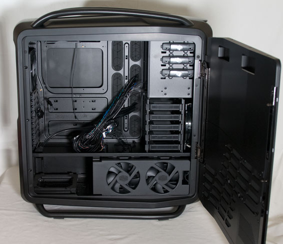
The sides are both covered with two hinged doors that have steel frames with aluminum finishes and ventilation at the bottom that lines up with six of the internal 3.5" drive bays; these doors open by pressing levers on the back of the case, but they're also easily removable by just lifting them off the hinges once they're open. Finally, the back is fairly mundane, sporting ten expansion slots plus an eleventh off-center one for extra ports or fan control, a single 140mm exhaust fan, and a removable power supply bracket.

The inside of the Cosmos II is just as spacious and copious as its exterior, and it's broken up into two chambers. The top chamber houses the motherboard (up to XL-ATX) along with a drive cage that holds five 2.5"/3.5" drives on sleds and the five 5.25" drive bays (two of which are occupied by Cooler Master's X-Dock 3.5" docking bay). There are a healthy number of rubber-grommeted routing holes in the motherboard tray, allowing for clean cabling for just about any configuration.
There are cut-outs in the metal divider between the top and bottom chambers, but you'll want to route most of the cable bundle back behind the tray. The bottom chamber has two 120mm fans mounted to an internal hinge that blow cool air across six additional 2.5"/3.5" drive sleds, and then the power supply is also mounted down here. Finally, the area behind the motherboard tray is spacious and easy to route cables in.
There's no real reason to expect assembling the Cosmos II to be difficult outside of its sheer mass, so if you're not a crybaby weakling like I am you'll probably have a much better time with it. Where I get concerned is with the use of chintzy plastic in parts of the assembly. The "fins" around the enclosure are easily bendable and I can see them breaking just like the control panel hood did (especially if you try and lift the case up by them), and while the aluminum finish on parts of the Cosmos II is nice, it's also prone to scratching.
In the reviewer's guide Cooler Master also tells us not to move the case by sliding it along the two bottom rails as it will damage the rails, but that seems ludicrous when the case is so heavy to begin with. I know it's counterintuitive to complain about both the weight and the use of plastic in this enclosure when the plastic is helping keep the weight down, but I feel that speaks to larger issues with the overall design. If you're not planning on moving the Cosmos II very often (and who would?) I can see where this won't be as much of a problem, but keep in mind that the dimensions of the case itself are enormous in the first place.


53 Comments
View All Comments
zappb - Monday, January 23, 2012 - link
Oh yeaDeath666Angel - Monday, January 23, 2012 - link
it just doesn't look very pleasing to me. Too much "1337 gamz0r pwn4g3".But that's just me. :-)
ReachTheSky - Monday, January 23, 2012 - link
I'd be proud to own that. I'm honestly getting a bit tired of minimalism. There's not a whole lot of flashy "HEY LOOK HOW BADASS I AM!" cases that are also functional.Death666Angel - Monday, January 23, 2012 - link
Like I said, just my own opinion. Nothing more, nothing less. And "badassness" and "functionality" are also very subjective, I wouldn't give this case high marks in either category, much less so considering the price. :-)michaelheath - Monday, January 23, 2012 - link
Agreed. This case is aimed at the crowd of people who pay through the nose for features that accomodate the other components they paid through the nose for. As a person who lives within his means and requires no more case than what provides room for a modest gaming/entertainment machine, the Cosmos II is pretty overboard in most aspects, and I could put $350 to better use.Sabresiberian - Thursday, January 26, 2012 - link
Actually, I think this case is made so people like you can get swelled heads about how well you manage your money.I have a suggestion: give up your gaming/entertainment altogether. After all, it's really nothing you actually require. It's not only a waste of money because you spend it on things you don't need, it's even more a waste of money because it takes up your time, as well, time you could be using to make money instead of spend it.
;)
aguilpa1 - Wednesday, January 25, 2012 - link
At this price I honestly expected it to have an integrated liquid cooling radiator with dual fans not just holes for one. I like to buy high end stuff but I still expect to get my money's worth. This isn't it.ZeDestructor - Tuesday, January 24, 2012 - link
You'd like the Lian Li PC-A71F then. Its a big, black monser of a case that I'm planning to build my next rig in, complete with dual watercooling radiators...Tetracycloide - Wednesday, January 25, 2012 - link
The thing is, it's really not that flashy in many respects. They basically took an ostentatious design and painted it matte black. Why they wouldn't go with cleaner lines or a color scheme that better accents the lines it currently has I have no idea. I think it fails on the aesthetic front by trying to split the difference between minimalism and snazzy, never quite reaching either and attempting to appeal to two tastes that are fundamentally opposites.Tetracycloide - Wednesday, January 25, 2012 - link
Now that I've looked at it a little more and seen some additional close up shots from other review sites I've decided to change my mind. The case is flashy but in tasteful way although the tastefulness is largely left up to the builder. The mesh areas have a unique polygonal design layered into them that's almost fractal. With the matte black brush aluminum finish and the right color backlights (blue was the wrong choice IMO) the case could be very beautiful. Personally I'm thinking amber LEDs myself. Without backlighting many of the aesthetics of the case are lost IMO and it just looks like minimalism in areas that don't make sense because the other areas aren't very interesting without lights so the minimalist areas don't contrast with them enough. If you can imagine those areas backlit with LEDs it's a completely different case. The unlit pictures don't do it justice I think.