The Microsoft Band 2 Review
by Brett Howse on November 30, 2015 8:00 AM EST- Posted in
- Wearables
- Microsoft
- Microsoft Health
- Microsoft Band
Using the Microsoft Band
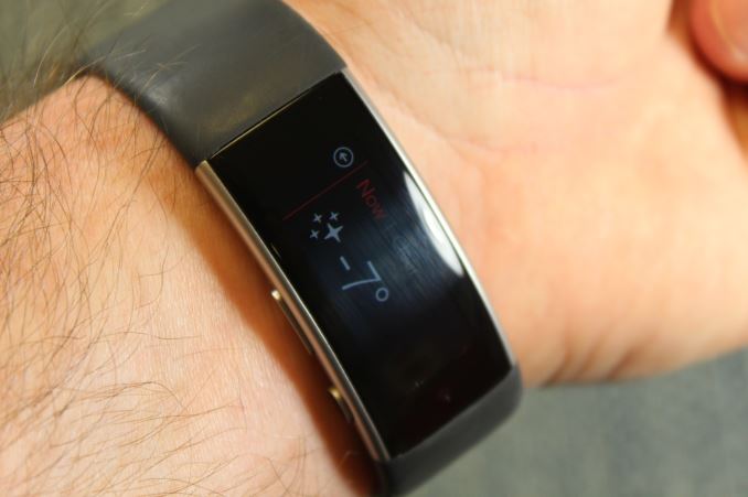
There is certainly something to be said about simple, and the Band’s user interface is postively simple. With a curved touch screen and just two buttons, navigation and interaction is quite easy. The user interface is based around the OLED display, so you are looking at a lot of high contrast white text on black backgrounds, which not only showcases the amazing contrast of OLED, but also reduces the power consumption. The user interface runs at around 30 Hz, so there is some noticeable jitter to it, but nothing that is too distracting on a low powered device.
Really the user interface starts with the initial pairing. When you first power on the Band, it quickly walks you through downloading the Microsoft Health app on a smartphone which is then used to pair the device and do all of the configuration. Very little is done on the Band itself, which is the correct way to do this since it’s not something that has to be done often, and a smartphone is much easier to accomplish tasks on. Once paired and set up, all interaction with the Band starts by pressing the on button to wake the display.
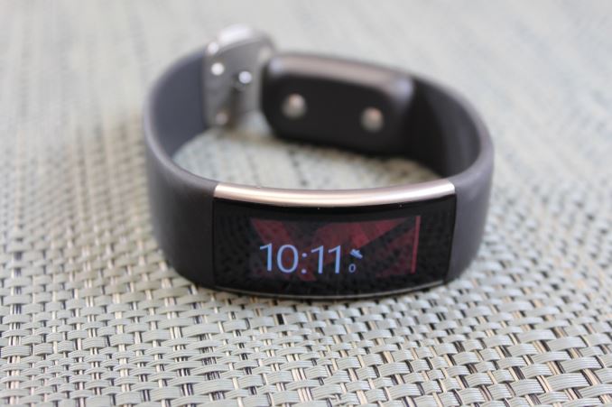
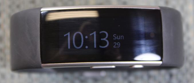
The home screen defaults to showing the date and time, and you can configure the background image through the Microsoft Health app itself. You can easily toggle this main screen to display other information as you would like, and the Band remembers where it was left, so you can have it always showing steps, distance, calories, stairs, or heart rate. The toggle is done with the action button, which is used for pretty much all functions. If you slide the display slightly to the right, you can see the Bluetooth connection status, heart rate monitor status, and battery status. The rest of the user interface is available by sliding the display to the left. Here will be a list of all of the tiles that you have added, and in the order in which you want.
To go into a tile, you just tap it on the screen. Interactions within an app on the Band all consist of a combination of the touch screen and the action button. To start the sleep tracker, you open it and press action to start the activity, or you can slide to the left to see information about the last time the activity was used. If an activity ever has an actionable task, there will be an arrow flashing on the display pointing towards the action button. It’s very easy to get around in the Band, and very easy to have it do what you would like. I think all smartwatches struggle a bit with user interaction due to their very small size, but I’m pretty happy with how easy it is to navigate and use the Band.
You can even do more complex tasks. If you get a text message, you can press the Reply button on the screen which will prompt you with a choice of how to reply. You can send a canned message, you can use the on-screen keyboard, or you can use Cortana to send a message. The on-screen keyboard is handy enough, and it is actually surprisingly decent at accuracy considering your finger is almost the size of the entire keyboard. If you want to send very short messages, you can use it, but it’s not much good for long responses, which are much more easily accomplished with your smartphone. Cortana works just as well as it does on the phone with speech recognition, and makes it a lot easier to send longer messages if you don’t mind talking to your wrist.
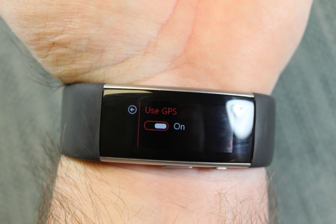
If you want to go for a run, you just open the running tile and press the action button. You’ll be prompted to turn on the GPS, and that’s it. Once you are done, slide the display to the left and choose End Session. The Band, being focused more on fitness than something like the Apple Watch, is completely capable of doing all of the work for tracking your run without the assistance of your phone. The built in GPS enables accurate distance tracking, as well as mapping out your routes (as long as you stay above ground).
The Band has some other cool features too, which are new to this version. The first is auto-rotate for the clock, which is as obvious as it sounds. You can set the clock to display when you turn your wrist, and you have to set the Band up so that it knows how you wear it. You just pick inside or outside, and left or right wrist. When the clock does come up, it’s just the white text on the black background. This avoids any unwanted bright lights flashing on your wrist if you were in a movie theater, and it saves a lot of power because when you enable auto-rotate, the clock is going to come on a lot more often than otherwise. This is very similar to the Glance functionality built into many Lumia phones.
They also added a smart-wake function. When it is enabled, and the Band is used as an alarm clock, it will wake up when it starts to feel the user waking up on theirown, up to thirty minutes before your alarm is to go off. This will apparently make you less groggy, since your body was already starting to wake up already. Luckily this is optional, since I don’t think everyone would subscribe to this even if it is based on sleep studies.
The other new feature is a UV alarm, which will let you know if you’ve had enough sunlight, and to warn you to put on some sunblock. This is not something I’ve had a chance to test out yet, since it’s winter now and daylight is already fleeting, but as someone that burns quickly, I would appreciate this in the summer.
Overall the Band has been a very easy device to wear and use. Accessing the tiles and functions on the Band are very easy to do, and the UI has been well thought out. Performance from the Cortex M4 processor is enough that it never feels sluggish, and even the on-screen keyboard is serviceable. I’d like to see some more work done on the sleep function though. The Band seems capable of knowing when I am asleep, so it would be nice if I would not have to enable the function when I’m going to sleep, and then disable it when I wake up. This is a minor issue, but would make the sleep function quite a bit better since it’s very easy to forget to turn it on before you go to sleep, and as easy to forget to turn it off when you wake up.


56 Comments
View All Comments
zeeBomb - Monday, November 30, 2015 - link
I got bands I got bands!zeeBomb - Monday, November 30, 2015 - link
I always admired the bands Microsoft made. Nice review Brett, definitely on my watch list this holiday season (see what I did there? :p)Fallen Kell - Monday, November 30, 2015 - link
I just personally have a hard time with these bands and smart watches... I mean, until they look like the below, I just can't see myself choosing the smart bands/watches over the real deal:https://omegaforums.net/attachments/2-jpg.39091/
plewis00 - Monday, November 30, 2015 - link
I would say this is pretty damn close:http://www.tagheuerconnected.com/product
kiwirayda - Saturday, December 5, 2015 - link
It should be for Six times the price and not quite the full feature set. Brilliant execution in style and form!JKflipflop98 - Saturday, December 12, 2015 - link
Looks like a big, gaudy chunk of obsolete junk to me.remo_mein05 - Thursday, December 3, 2015 - link
Nice watch..http://theyouthjob.com/?ref=103109nandnandnand - Monday, November 30, 2015 - link
Banned from AbandTechAshinjuka - Friday, December 4, 2015 - link
Soundtrack by Flosstradamus!⚠ ⚠ ⚠ https://soundcloud.com/flosstradamus/b-nned-2 ⚠ ⚠ ⚠
duploxxx - Monday, November 30, 2015 - link
nice features and design but also expensive